photo home-63.png photo about-52.png photo portfolio-4.png photo contact-51.png

Friday, September 4, 2015

The Perfect Guest Room Essentials


It's Labor Day Weekend! We're headed up to our lake house and looking forward to hosting some good friends over the holiday. With that in mind, I've been making a list of the little details that would make any guest more comfortable...


Fresh flowers on the nightstand are top of my list...


Fancy water in glass bottles is so much nicer than plastic Crystal Geiser bottles...


A luxe candle is a must...


Byredo candle


...As are a dish of matchbooks with delightful covers. (If you like matchbook art, this Instagram account is very cute.)


Upgrade your tissue box situation with this sleek alternative to the cardboard pattern box they come in....


Container Store tissue holder


A stack of fresh, fluffy towels already in the room makes guests feel more at home.


D Porthault violettes lilac towels


Vintage luggage racks are an unexpected but welcome touch.


vintage luggage rack

Make sure you have plenty of hangers lined up and ready for use in the guest room closet.


velvet hangers


Soft throw blankets will keep your guests feeling cozy and spoiled.
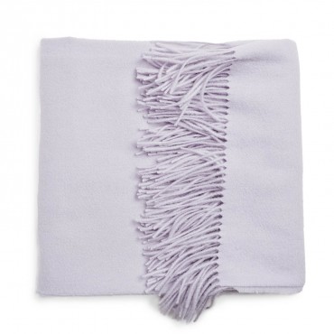


Yves Delorme lilac throw 

Lastly, a guest book on the nightstand for visitors to write in is a fun record of all the friends and family who've spent time in your home. 


guest book

Hope everyone has a happy and safe Labor Day!


Friday, August 28, 2015

JMI E-Design Has Arrived!


Happy Friday, everyone!

We are thrilled to announce the launch of our e-design service here at Jennifer Muirhead Interiors.


What is e-design, you're wondering? Why, dear reader, I'm so glad you asked! 

E-design is the perfect way to work with us even if you're not located in the Los Angeles area, or if you're someone who might not need our full range of services and prefer to work at your own pace.  
Our e-design client is someone who wants to utilize our creative services but isn't afraid to tackle the execution on his or her own. 


But how does it all work, you ask? The process is simple: you tell us what you need and how much you want to spend, send us room measurements (which we will walk you through, step by step) and a few photos, and in 4-6 weeks, we send you a fully customized plan, tailored to your lifestyle and budget. 


What you'll receive from us is a vision board that helps you understand how the room will look in the end, a to-scale floor plan mapping out where each piece should be placed and a complete shopping list detailing where and exactly what to purchase. To make your life easier, we'll also include a set of portable swatch  books--one for fabric and paint, the other featuring furniture, accessories and art--that you can toss in a bag to take shopping. 


Want to learn more? Interested parties should check out the E-Design tab on our website.

Cheers to the weekend!

Friday, August 7, 2015

Raising a Glass: My Favorite Glassware of the Moment


This summer was a rough one on our drinking glasses so it's time for some new ones. A simple enough task, you say? Just pop over to Target and pick some up, you say? Ha. Interior designers are raging perfectionists who've put a convenient professional sheen over their disorder. 

So indulge me while I run down my list of contenders for new drinking glasses:

My go-to for years was the CB2 Marta tumbler, but I've had to constantly replace them, which is getting annoying. That doesn't stop me from admiring their newer, more colorful model, though:


Up in Lake Arrowhead, we're really embracing the country vibe, so we use the blue Ball mason jars. Should I go country in the city?


I also really love Crate and Barrel's multi-use working glasses. I seem to always be short on food storage containers, and I'd like to move away from all the plastic. Seems a good option, no?


However, I also love the graceful spin Williams-Sonoma put on the working glasses. It's more of a  Euro bistro vibe, which makes sense as they're made by Duralex, a mainstay of the French cafe scene:


C and I were out to dinner recently at Blue Plate Oysterette and were really taken with the whole East Coast vibe in there. They have these cute recycled wine bottle tumblers that were so fun. 


A recent favorite source for dinnerware (and everything else, really) is Farmhouse Pottery, so I definitely had to check out their offerings. I really love the double wall glasses that hold both hot and cold drinks. And they're so pretty (let's be honest--this is my priority)!


And I couldn't resist these delicate beauties. The description claims they work for hot or cold drinks as well, but I'm not totally convinced of their strength. Don't want to have to order new ones constantly. Gorgeous, though, right?


Schoolhouse Electric always has something special on tap, and these petite stacking tumblers don't disappoint. If only I could have mine on permanent display next to a cute bottle of ginger beer. Also, I've noticed that men generally prefer larger glasses (Why is this? Do you find this to be true, too?) so these might be out of the running.


Heath Ceramics is another of my very favorites when it comes to tableware. The simple beauty of these super durable, streamlined glasses, also by French company Duralex, is refreshing.


While I was on their site, I noticed they carry the Soma water carafe and filter. I've heard such amazing things about this--have you? Has anyone tried it? I'd love to hear your thoughts.


Decisions, decisions...What's your favorite? Have any in mind that I didn't include here?


Tuesday, July 14, 2015

Restaurant Design: Nopi London (Or How Many Times Can I Write the Word "Brass" in a Single Post?)

Hi everyone! Hope you're all enjoying your summer and getting to log some travel miles while you're at it. Speaking of, I'm just back from London which has quickly become my favorite city. I'm sure I said this about 273 times while I was there but, I'd move there in a heartbeat!

I was there once before in college and this was a much different experience. We had a child-free week  (Sorry P. We'll bring you next time!) of amazing restaurants, site seeing and Wimbledon madness.

Back to design: the best, best, best meal we had was at Yotam Ottenlenghi's Soho restaurant, Nopi. The food could be a whole other blog post, it was that delicious, but round these parts, we stick to the pretty stuff...


Black, white, brass--all the things I love in life.


Touches of brass throughout created the vintage yet modern atmosphere.


These oversized brass books in the downstairs dining room are genius. I especially love how they were repeated in rows on each wall. 


Obligatory #infiniteselfie that I took in the mirrored WC. #designdork


The Strawberry Rose Petal Mess was another level of dessert.  Recipe here


And a little inspo board for those of you into the Nopi look.


Friday, May 15, 2015

Hancock Park Refresh Photos


Happy Friday everyone! We've had a busy few weeks here at JMI, completing a bunch of mini-installations and wrapping up one of my favorite client's homes with a fun photo shoot for the old portfolio.

I posted some cell pics a few weeks back, but I'm excited to share the professional shots, courtesy of the amazing photographer, Jayme Burrows.

I started working with these clients about a year or so ago. They were looking to move their daughter out of her nursery and into a "big girl" room.  I had recently gone through this momentous transition myself with Penelope, so I was really excited for them.


We ended up using a lot of her daughter's own artwork on the walls, which is one of my favorite things to do in kids' rooms. 


We even left her chalkboard art on her easel for some authenticity. 


A short while later, I was tasked with the happy job of creating a nursery space for their soon-to-be-born baby boy. We kept things modern but not overtly masculine and were pretty much ready to go when he arrived!


Things moved on to the dining room and living room after that. I am completely obsessed with the rug we sourced for the dining room. (Yay, etsy!)


My favorite shot of the day...


Just a little corner of the master...


We were really happy with how everything turned and the clients' couldn't have been lovelier or more fun to work with. I hope they enjoy their new space!


Friday, April 24, 2015

Coming Soon: Jennifer Muirhead Interiors Office Update!

Hi ya'll! It's been a few years since I've done anything to my office/studio which sometimes doubles as a guest room. I've been pretty happy with the Parker Palm Springs vibes that I've been working over here, but I've got the itch to switch things up.

Since hiring an assistant a few months back and adopting a dog who's constantly in and out, the office space is seeing much more activity than when it was just little old me. So here's what's inspiring me to bring a fresh look to our office:


I'm looking for soothing neutrals with lots of textural interest...


Someplace to corral all of my pretties...


Lots of bright light...


And plenty of space to spread out!


I'll keep you posted!


SITE DESIGN BY FABULOUS K